Most of my sources (I also used a couple scenes from Watchmen)

My finished product:

Details/descriptions:


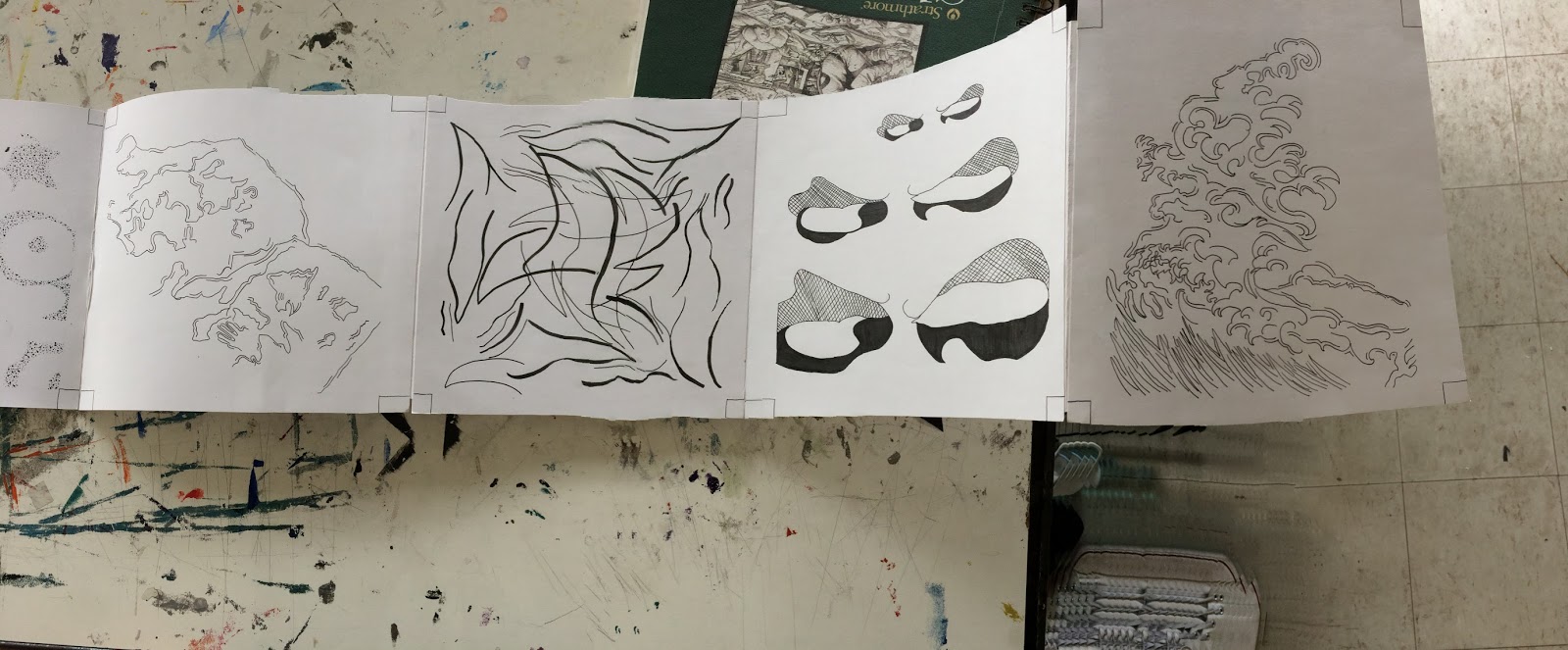
I ended up with a few different "sections" of my final compositions. These three were very centered on line and movement, I really liked how it looked to add extra lines to the inside and outside. I spaced these three out within my final compositions to keep the eye moving as you looked at my project.


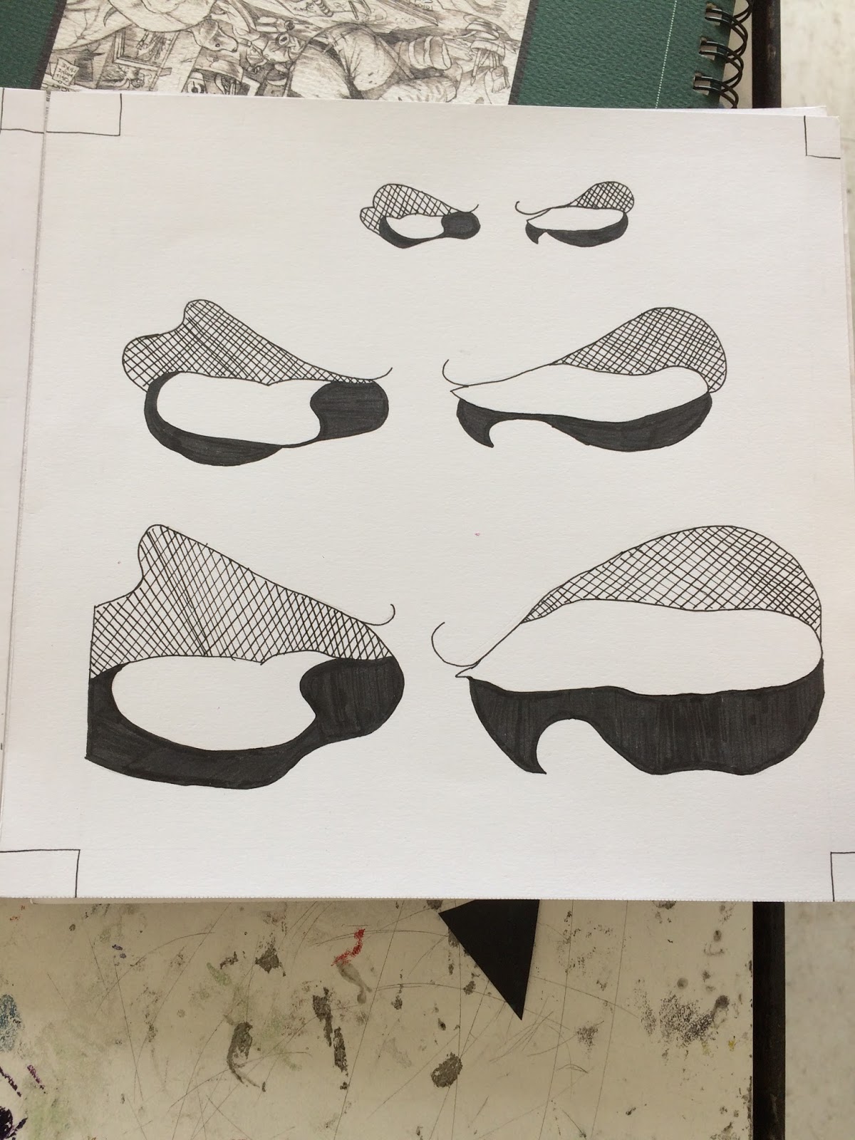
For these three I used some tracings from the Watchmen graphic novel. I really like the first one because everyone who looked at it saw something different which is ironic because its actually the mask of a character called Rorschach. For the second one I tried scaling things up for the first time. It was really hard to make it look good and I think this is definitely one of my weaker compositions because of that. The perspective was hard to capture because all you see are the eyes, you can't tell the character was looking to the side. The third one is one of my favorites. It's the Night Owl's ship, there's a large front-view of the ship and then all the little "bean" shaped things are a side view of his ship. I really like the contrast of coloring different parts of it and it also definitely has movement because the ships lead the eyes to move onto the next composition.


The first and second compositions were also some of my weaker ones but I also learned a lot through doing them. The first one looked a lot better when it was smaller because the deer were small and easier to draw, as I tried to scale them up their shapes got lost. But again, it was good scaling practice. The second one does look cool, I like how it flows through and kind of reminded me of the movement of the sun and planets on the ecliptic (can you tell I'm currently in astronomy?). I saw other people's dot-oriented compositions and I think what they did differently is they had different colors, some more gray and some more black to create more dimension. Some people left white space in their dots to also add more dimension. I would also add more to cover up all the white space. The third composition is one of my favorites, to me it looks like a horizon if you cut it in half. The diagonal lines look like a sunset and the bottom half is like a reflection in the water.
General reflections:
This project was overall really hard for me, as a major in graphic design I've never really done art projects by hand, I usually do them digitally. I'm also not used to doing abstract, it's something I find really hard to create something you can't actually see. But at the end of it, I'm proud of myself. I have some weaker things but in all of my compositions I pushed myself to try something new, especially with the scaling.
No comments:
Post a Comment